
Rewriting Naval Documents of the American Revolution
Between 2023 and 2025, the Naval Documents of the American Revolution undertook a major rebranding initiative, supported by the National Endowment for the Humanities. The project’s editors sought to reimagine NDAR’s visual identity—bringing a fresh, cohesive look to a long-standing scholarly enterprise. At the center of this work was Ashley Donohoe, then an undergraduate at the University of Virginia, who guided the design process with creativity and vision. Before graduating, Ashley documented her approach, offering insight into the choices and inspirations that shaped NDAR’s new visual direction.
For Naval Documents of the American Revolution, particular care was given to typography, drawing inspiration from the visual culture of the eighteenth century. The project’s choice of font pays homage to the period’s everyday typefaces while ensuring readability for a modern audience. Few fonts embody that balance better than the Garamond family. From its origins in the sixteenth century, Claude Garamond’s designs were intended to echo the legibility of pen-and-ink handwriting while elevating it into something both elegant and practical. Over the centuries, type designers have continually returned to Garamond’s distinctive serifs and graceful linework, adapting the face for new technologies and tastes. Because of its refinement and efficiency on the printed page, Garamond has long been a favored typeface in scholarly publishing.
It's important for other reasons, too. It is a historically appropriate typeface, something many editors or historians don't typically think when they're researching and writing. On the other hand, book designers likely think about this all time! Using a default typeface like Times New Roman would flatten the historical character of the Naval Documents of the American Revolution. While serviceable for generic word processing, it lacks the refinement, lineage, and contextual resonance of Garamond, making it ill-suited for a project that seeks to evoke the texture and typography of the eighteenth century.
As technology shifted from movable type to digital screens, the Garamond family also evolved. The versions most familiar in the eighteenth century, such as ITC Garamond, were conceived without any thought of computers or the internet. Yet a lineage of designers has carried forward the spirit of Garamond, reinterpreting its essential qualities for new contexts while preserving its historical character.
The font selected for the Naval Documents edition—Cormorant Garamond—belongs to this living tradition. Created by Christian Thalmann, it is a twenty-first-century reimagining that honors Garamond’s heritage while embracing the possibilities of high-definition digital typography. Unlike more utilitarian digital variants, such as EB Garamond, Cormorant Garamond distinguishes itself through its delicate brushstrokes, sculpted curves, and versatility at any size. It captures both the elegance of its Renaissance forebear and the crispness demanded by modern screens.
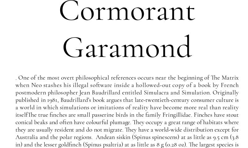
Its very name underscores this character. The cormorant, a sleek diver with a commanding presence, embodies grace and adaptability—qualities Thalmann sought to express in his design. Just as the bird thrives both on water and in the air, Cormorant Garamond flourishes in large display settings as well as in the dense thickets of body text. For the Naval Documents of the American Revolution, it serves as a bridge between past and present: a font rooted in centuries of tradition yet finely tuned for the digital age.